A Closer Look at This Oysterflex Replica and Why Its Balance Matters More Than Its Color
Introduction
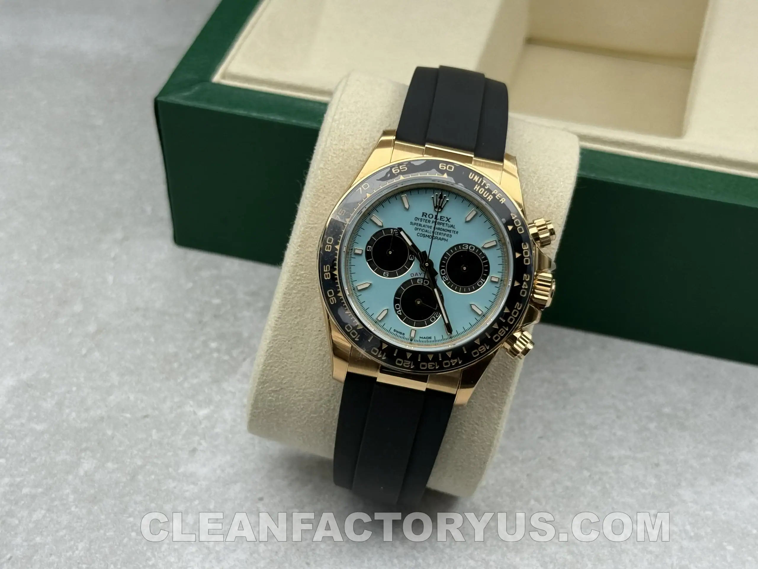
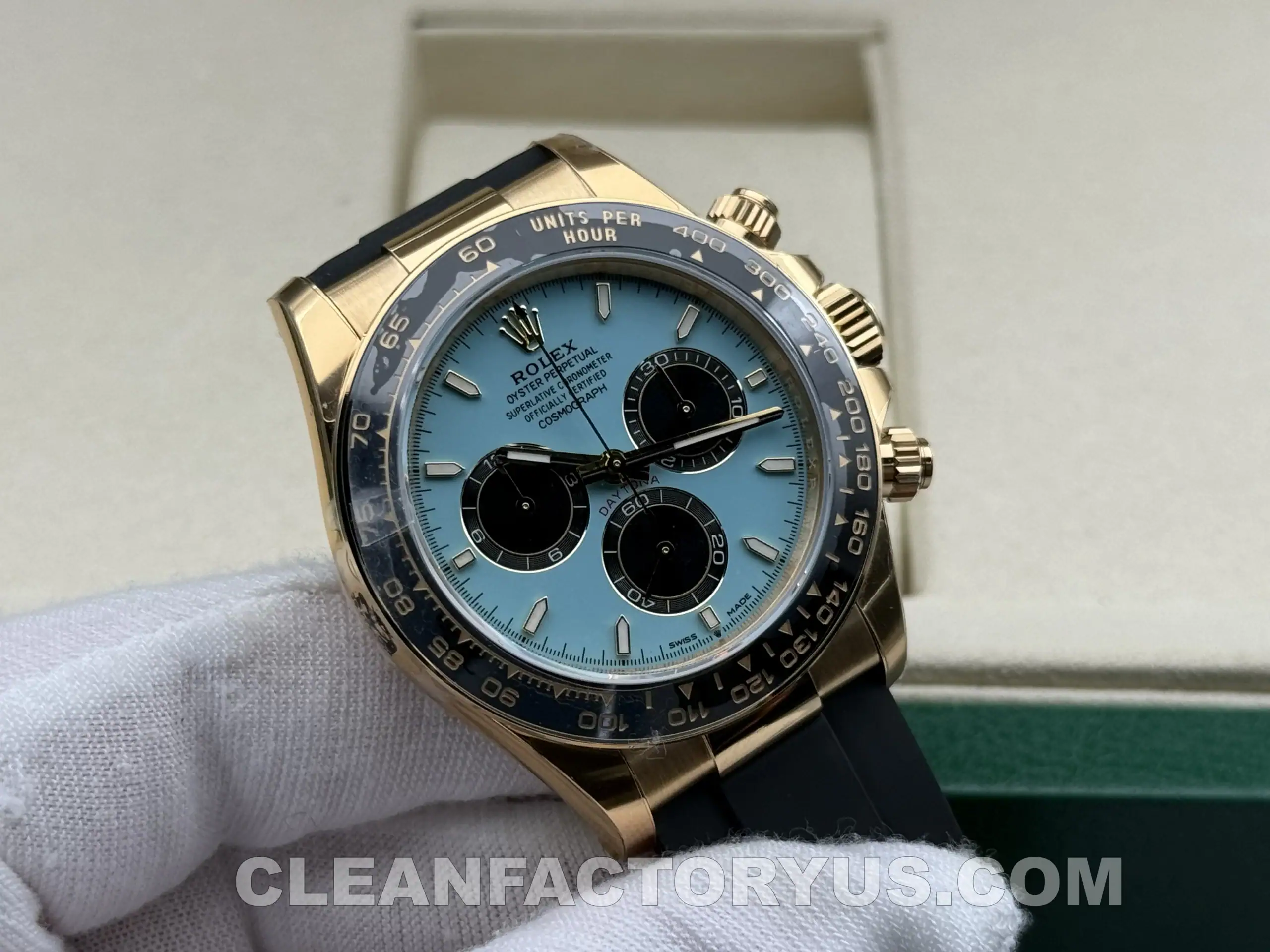
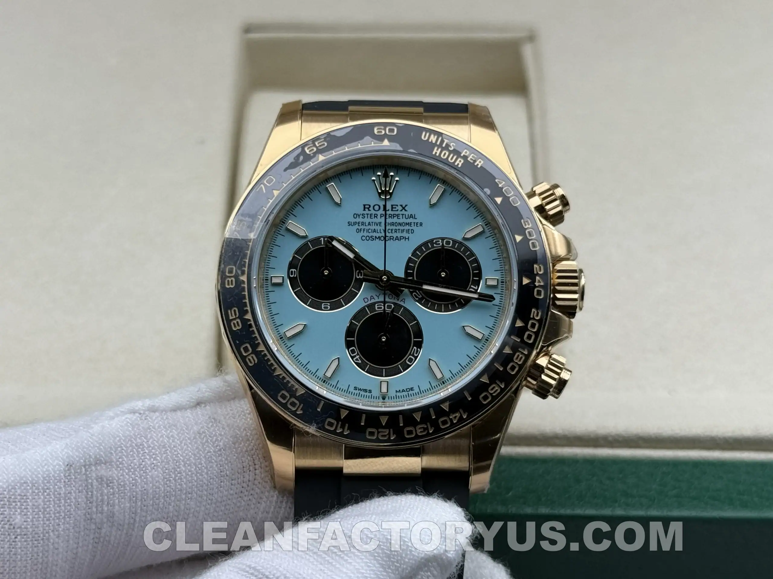
Among modern Daytona references, the 126518LN with a turquoise blue dial is not the kind of watch that quietly disappears into the background. Even within the Daytona family, it feels more expressive than most. The black Cerachrom bezel keeps one foot in the familiar Daytona language, but the turquoise dial and Oysterflex strap pull the watch in a different direction—something more playful, more visual, and slightly less formal than the classic steel Panda or black-dial versions.
That shift in personality is exactly what makes this reference more interesting in replica form.
A steel Daytona usually lives or dies on proportion, case shape, bezel execution, and dial balance. This watch still depends on all of those things, but it adds another layer of difficulty: color. The turquoise dial has to feel bold without becoming toy-like. The yellow gold tone has to look warm and rich without turning too bright or brassy. The Oysterflex-style strap has to keep the watch grounded, otherwise the whole thing starts feeling like a novelty project rather than a complete watch.
That is why the Clean Factory Rolex Daytona 126518LN deserves to be judged a little differently. This is not a reference that succeeds through one dramatic feature alone. It has to work as a full composition. Case finishing, dial tone, bezel restraint, strap integration, and chronograph feel all matter here.
This review looks at the watch from exactly that angle. Not as a genuine Rolex, and not as a product-page pitch, but as a high-end replica trying to recreate one of the more unusual and visually demanding modern Daytona configurations.
Why This Reference Is Harder to Get Right
The Daytona is already one of the most scrutinized Rolex models in the replica market. People know the case shape, the bezel layout, the subdial structure, and the way a modern Daytona is supposed to wear. But the 126518LN with a turquoise dial introduces a different kind of challenge.
A white Panda or black-dial steel Daytona is judged mostly on correctness. This watch is judged on correctness and mood at the same time.
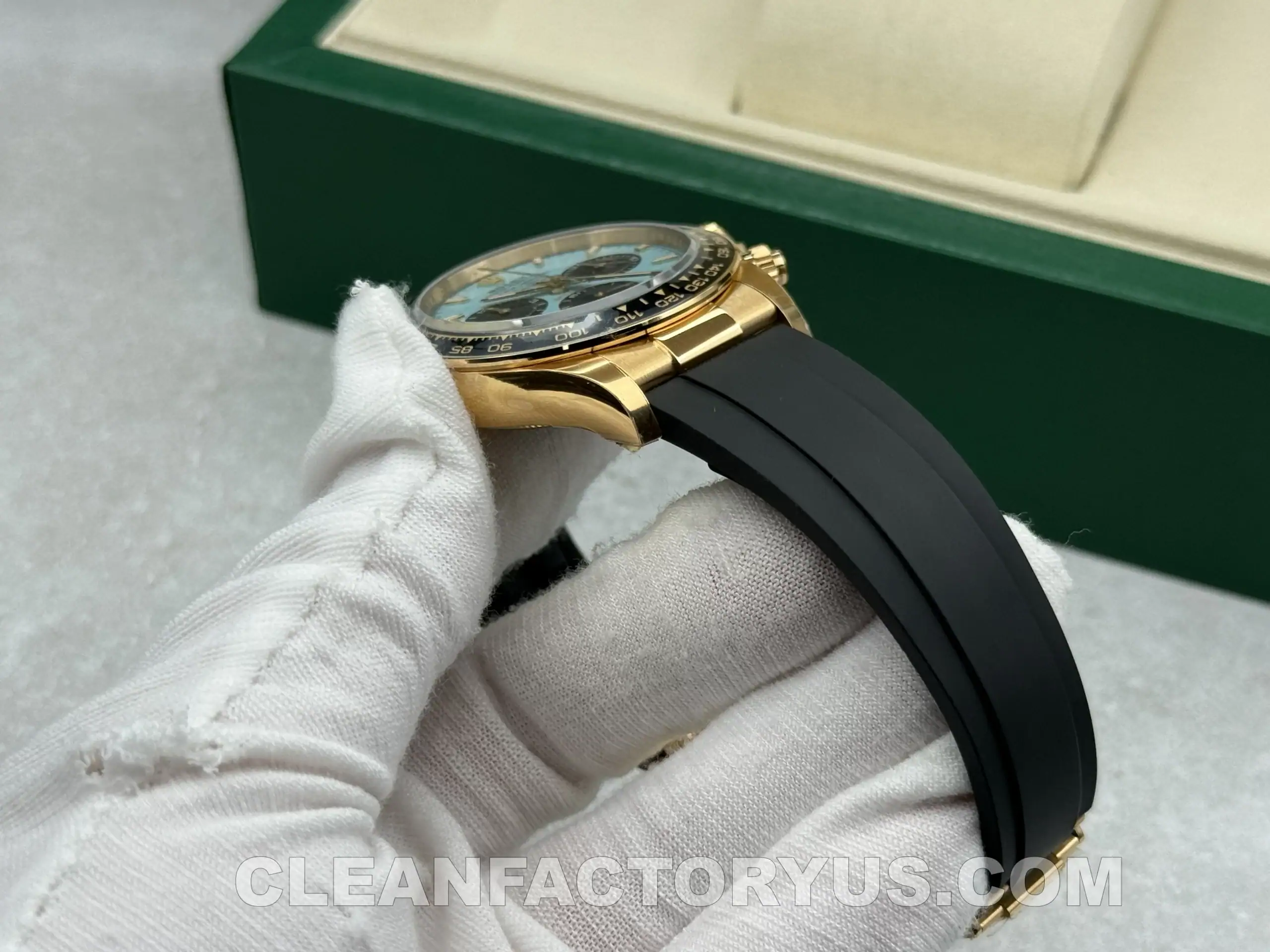
That is a harder combination to execute well. A turquoise dial can easily go wrong. It can feel too pale, too saturated, or too synthetic. Yellow gold tone can also become a problem very quickly if it loses subtlety. On top of that, the Oysterflex-style strap changes the way the watch sits on the wrist and changes the visual balance of the case. A bracelet Daytona spreads its presence differently. On rubber, the case becomes more central to the entire experience.
So the question here is not just whether Clean Factory copied the case shape well enough. It is whether the watch feels resolved as a design. Does the color make sense with the case? Does the black ceramic bezel still ground the watch enough? Does the strap make it feel sportier in the right way, or does it take away too much of the premium feel?
That is what makes this model worth discussing. It is not simply another Daytona with a brighter dial. It is a watch where the success of the replica depends heavily on whether all the parts cooperate.
First Impressions: More Controlled Than the Specs Suggest
On paper, the recipe sounds risky: yellow gold, black ceramic, turquoise dial, black rubber strap. That combination could easily become too much.
In practice, the watch is more disciplined than expected.
The black bezel and black Oysterflex-style strap do a lot of quiet work. They frame the dial, contain the gold tone, and stop the watch from becoming visually chaotic. That matters because the turquoise dial is already expressive enough. Clean Factory seems to understand that the rest of the watch cannot compete with it. The bezel stays restrained. The case stays compact. The strap keeps the watch sporty rather than ornamental.
That balance is one of the reasons the watch feels more wearable than its specification sheet suggests. It is still a noticeable watch, of course. No turquoise-dial gold-tone Daytona is subtle. But it does not feel random or overdesigned. It feels like the dial is the focal point, while everything else has been kept under control to support it.
On the wrist, that translates into a watch that feels more athletic than flashy. And that is probably the most important thing for a reference like this. It still feels like a Daytona first, just one with a more modern and expressive personality.
Performance Snapshot
| Category | Verdict |
|---|---|
| Overall finishing | Strong |
| Dial execution | Very strong |
| Bezel presence | Well controlled |
| Case proportions | Close to expected Daytona feel |
| Strap comfort | Excellent for daily wear |
| Movement feel | Stable and convincing |
| Biggest strength | Overall design coherence |
| Main limitation | Material depth vs genuine yellow gold |
Case and Profile: The Daytona Shape Still Has to Carry the Watch
The modern Daytona case is deceptively hard to execute well. It looks simple, but the entire watch depends on compactness, tight proportions, and clean side profile behavior. If the case becomes too thick, too soft, or too swollen, the elegance of the Daytona disappears very quickly.
Here, the case performs well enough to preserve the expected character.
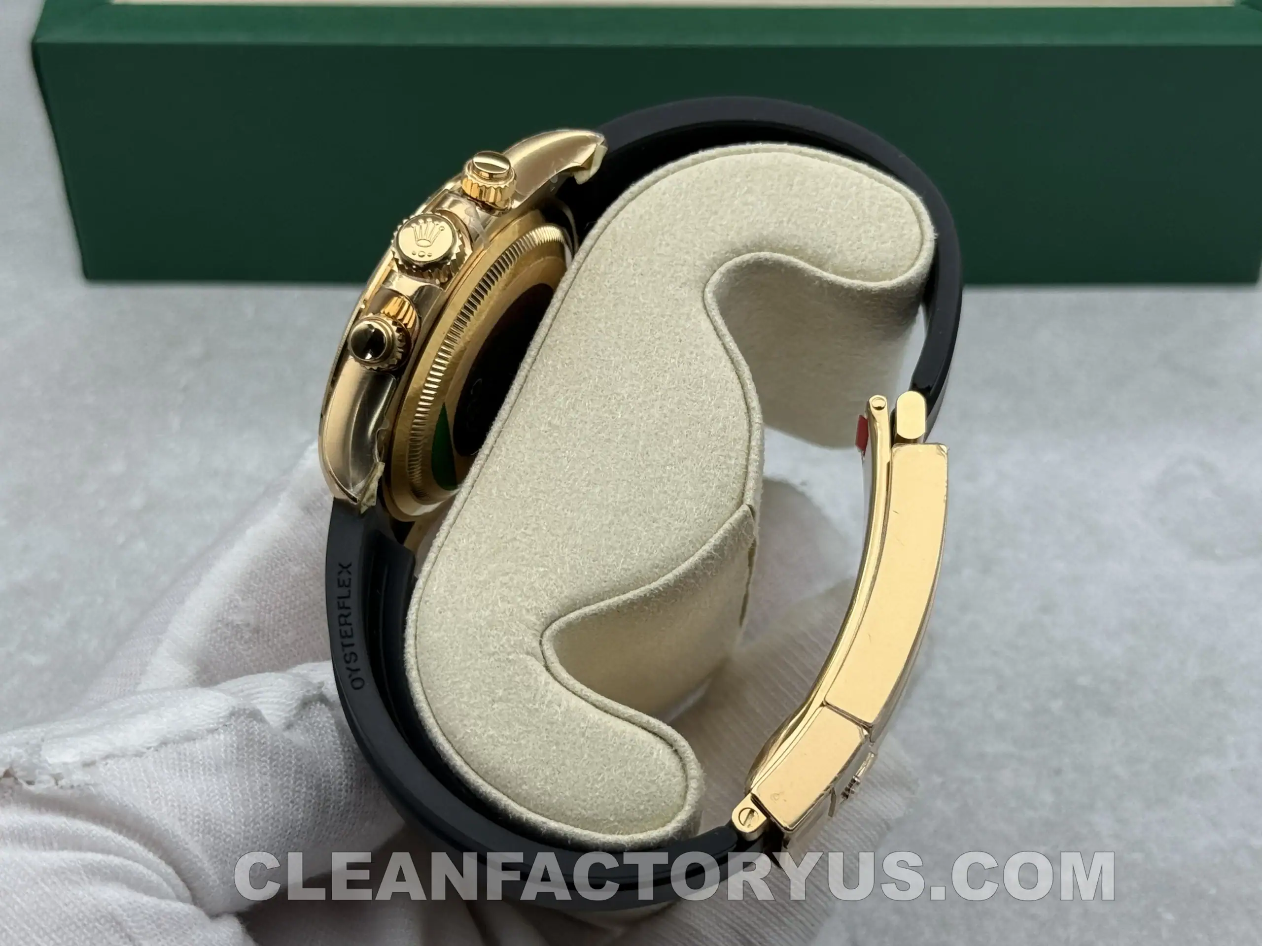
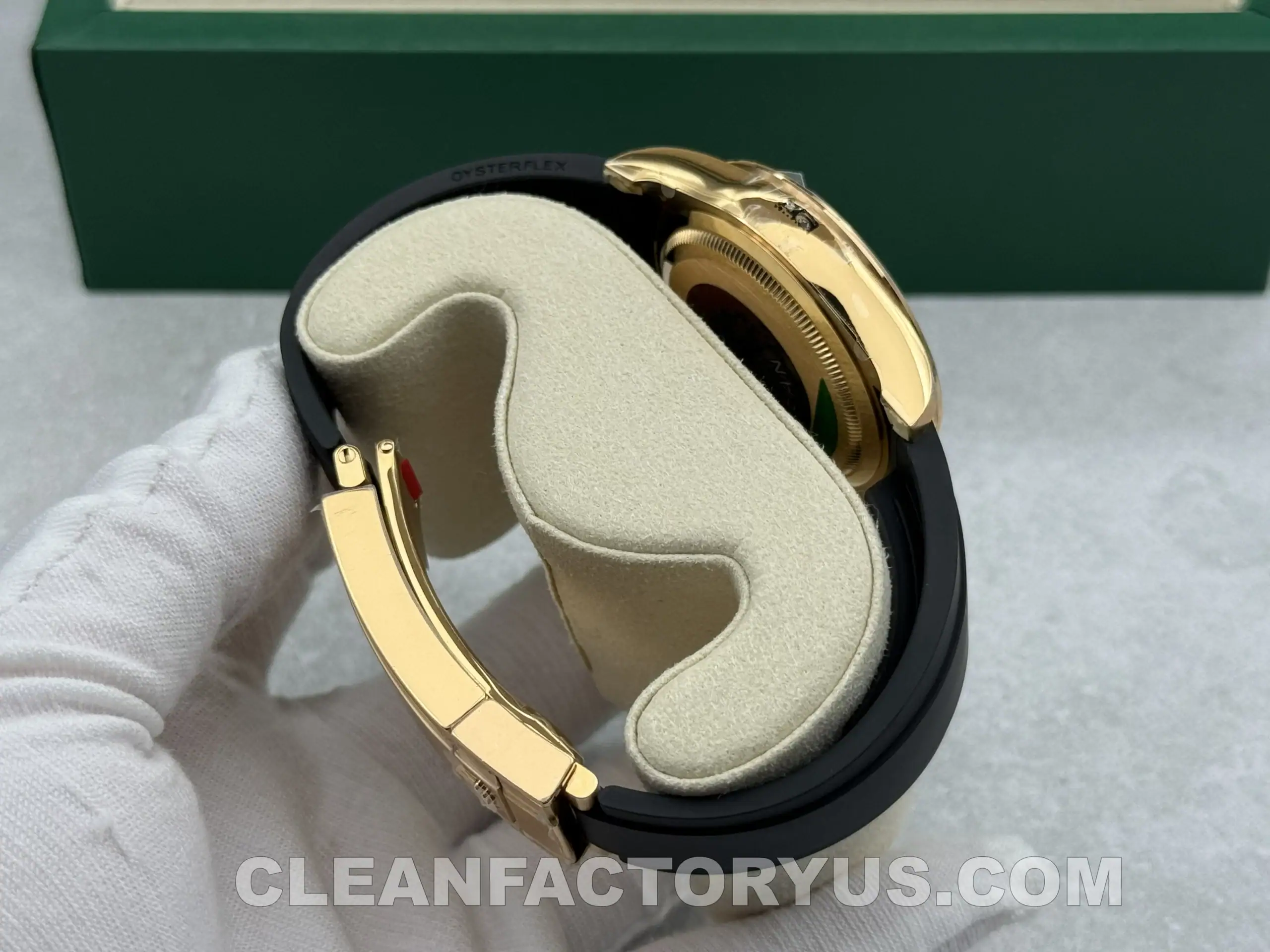
The 40mm footprint feels correct, and more importantly, the watch keeps the compact stance that makes a Daytona feel controlled rather than oversized. This matters even more on Oysterflex, because the strap does not visually distribute the watch in the same way a bracelet does. The head of the watch carries more of the presence on its own.
The lugs are shaped cleanly, the polished case flanks reflect light as expected, and the pusher layout feels properly integrated rather than crowded. The crown and guard area also look proportionate, which helps the side profile stay neat.
Clean Factory has also kept the thickness close enough to the expected Daytona profile that the watch avoids the top-heavy feeling that weaker chronograph replicas often suffer from. That alone helps the overall impression significantly.
Compared with the genuine watch, the last level of refinement in case finishing and surface transitions still belongs to the original. But in terms of broad geometry and wearing posture, this version stays close enough that the identity of the genuine watch comes through clearly.
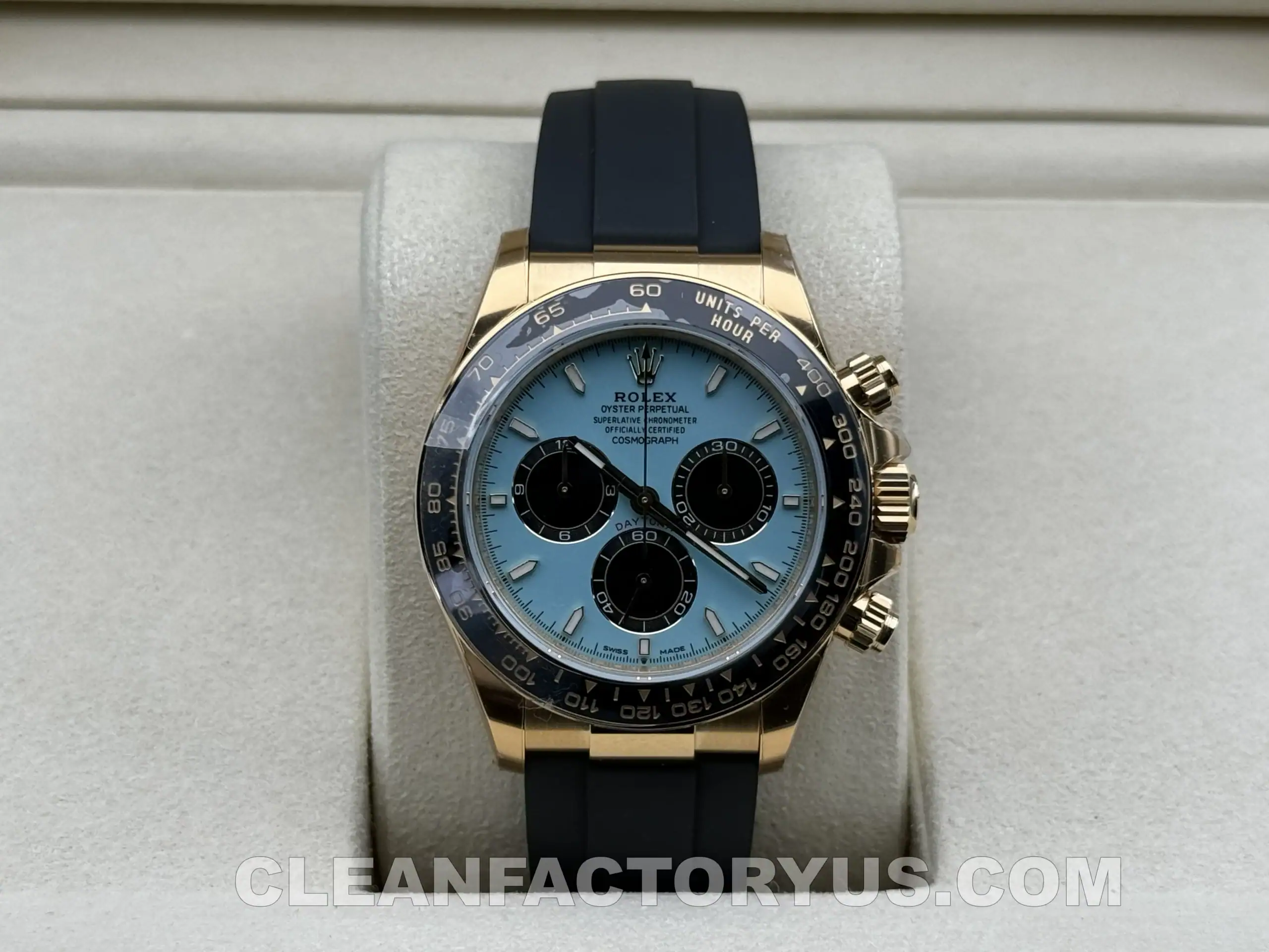
The Turquoise Dial: The Entire Watch Depends on This Working
On this reference, the dial is not just another component. It is the center of the entire watch.
That also means it is the part with the highest risk. If the turquoise tone feels wrong, the whole watch feels wrong. No strong case or good strap can save it.
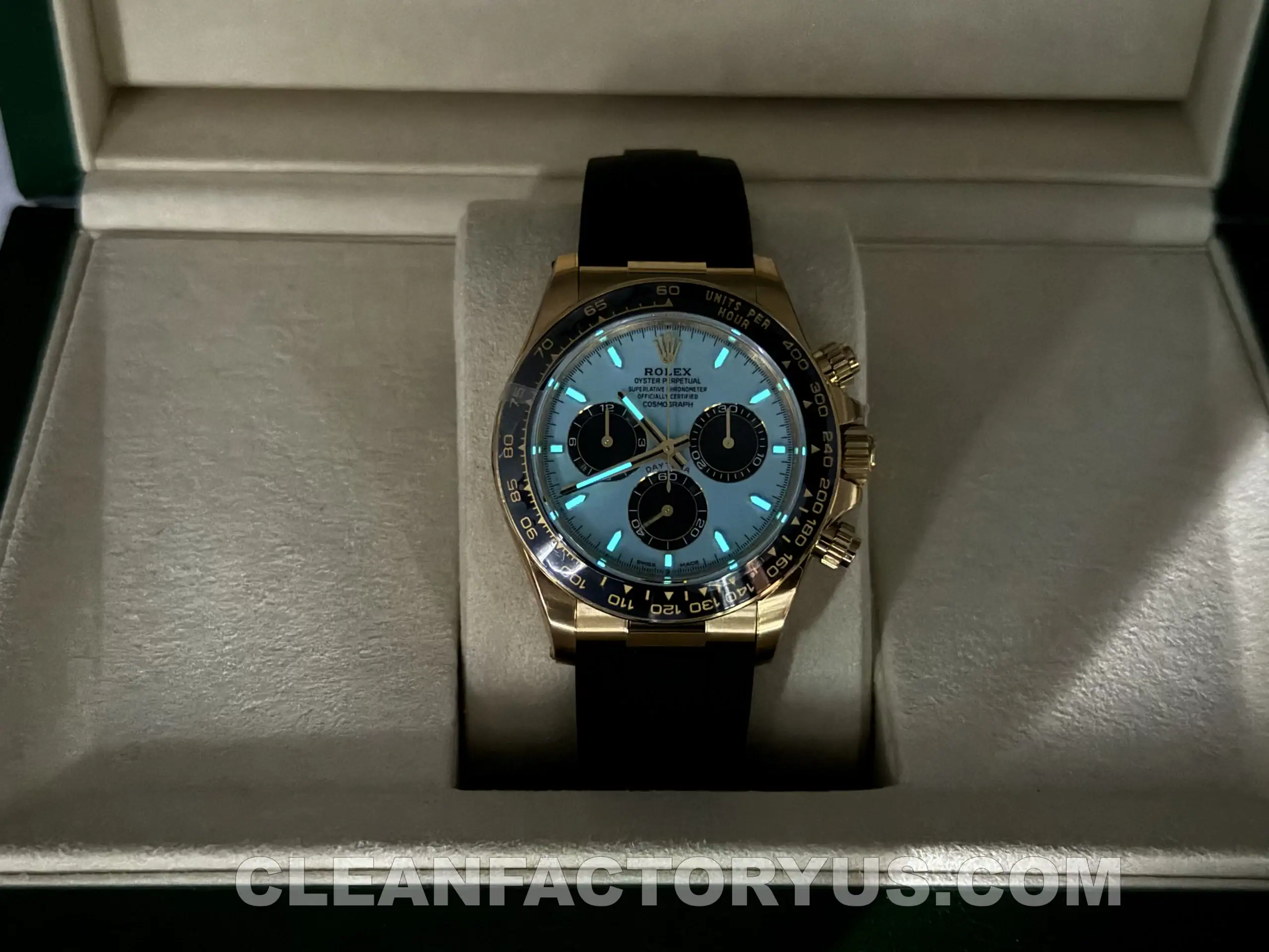
The good news is that this dial works better than many buyers might expect. It is bright, but not in a toy-like or synthetic way. It has enough gloss and depth to feel deliberate, and the tone sits in a range that works with the black bezel and yellow gold tone around it. It does not feel like an unrelated novelty dial placed into a Daytona case. It feels designed to live there.
The black subdials help a lot. They add structure and stop the dial from becoming too flat or too decorative. The contrast between the turquoise surface and the darker chronograph elements is one of the reasons the watch remains coherent.
The printing is also handled with enough restraint that the dial never becomes visually noisy. The markers, hands, and text stay organized, which matters because a dial like this can quickly become too much if every element tries to stand out at once.
This is probably the strongest part of the watch. Not because it is loud, but because it had every reason to fail and mostly did not.
Bezel Execution: The Black Ceramic Keeps Everything in Line
The black Cerachrom-style bezel is easy to overlook on a Daytona because it is so familiar, but on a watch like this it performs an especially important role.
It is what keeps the design disciplined.
Without the black bezel, the turquoise dial and gold-tone case would probably feel much softer and much louder at the same time. The bezel adds contrast, structure, and seriousness. It keeps the watch in Daytona territory rather than letting it drift into something more decorative.
This version handles the bezel well. The ceramic surface has enough depth and gloss to feel convincing, and the tachymeter scale is visually controlled. It does not look overfilled, overly bright, or too aggressive. That matters because an overdone bezel on this watch would make the entire composition feel forced.
The bezel also sits correctly enough in relation to the crystal and case that the watch keeps its expected visual balance. On weaker Daytona replicas, bezel thickness or edge behavior can disrupt the entire dial-to-case relationship. That does not really happen here.
So while the bezel is not the most exciting part of the watch, it may be one of the most important. It is the component that quietly keeps everything else under control.
Crystal and Dial View: The Small Details Matter More on a Bright Dial
On a bright-dial watch like this, crystal behavior becomes more noticeable than usual. Any haze, distortion, or awkward reflection can make the dial feel cheaper very quickly.
Fortunately, the crystal here stays out of the way. It keeps the dial sharp from ordinary viewing angles and allows the turquoise tone to remain clean and readable. That helps preserve the premium feel of the face.
The small crown at six o’clock is also there and handled neatly enough to support the overall impression. The rehaut engraving, while not the headline feature in daily wear, is tidy enough that it does not distract from the dial. These are not the details that sell the watch, but they are the details that help it feel finished after the first impression wears off.
Subdial layout and depth also deserve mention. On the Daytona, these are never just decorative elements. If the subdials feel too flat or disconnected, the dial loses its rhythm. Here, the watch keeps enough dimensional structure that the face still feels crisp and deliberate.
How Complete Does the Overall Finishing Feel?
This is probably the most useful question to ask of a watch like this.
Not whether one feature is impressive. Not whether one specification sounds good on paper. But whether the watch feels complete as a full object.
That is where this version performs well.
The dial, bezel, case, and strap all seem to belong to the same design idea. The turquoise dial is clearly the focal point, but the gold tone, black bezel, and Oysterflex-style strap all support it without fighting for attention. That kind of coordination is not always easy to achieve on a watch with this much visual character.
A black Submariner can survive a little inconsistency because the design is restrained by nature. A colorful gold-tone Daytona cannot. If the finishing standard shifts too much across the watch, the entire effect starts to collapse.
Clean Factory avoids that problem better than many lower-tier alternatives. The gold appearance is controlled, the bezel feels integrated, and the strap does not feel like an afterthought. The watch feels resolved enough that it works in actual wear rather than only in product photos.
That does not make it perfect. The genuine watch still carries a richer sense of material truth and refinement. But as a complete replica, this version feels better integrated than many watches that rely too heavily on one standout detail.
Movement and Chronograph Feel: More Important Here Than It Sounds
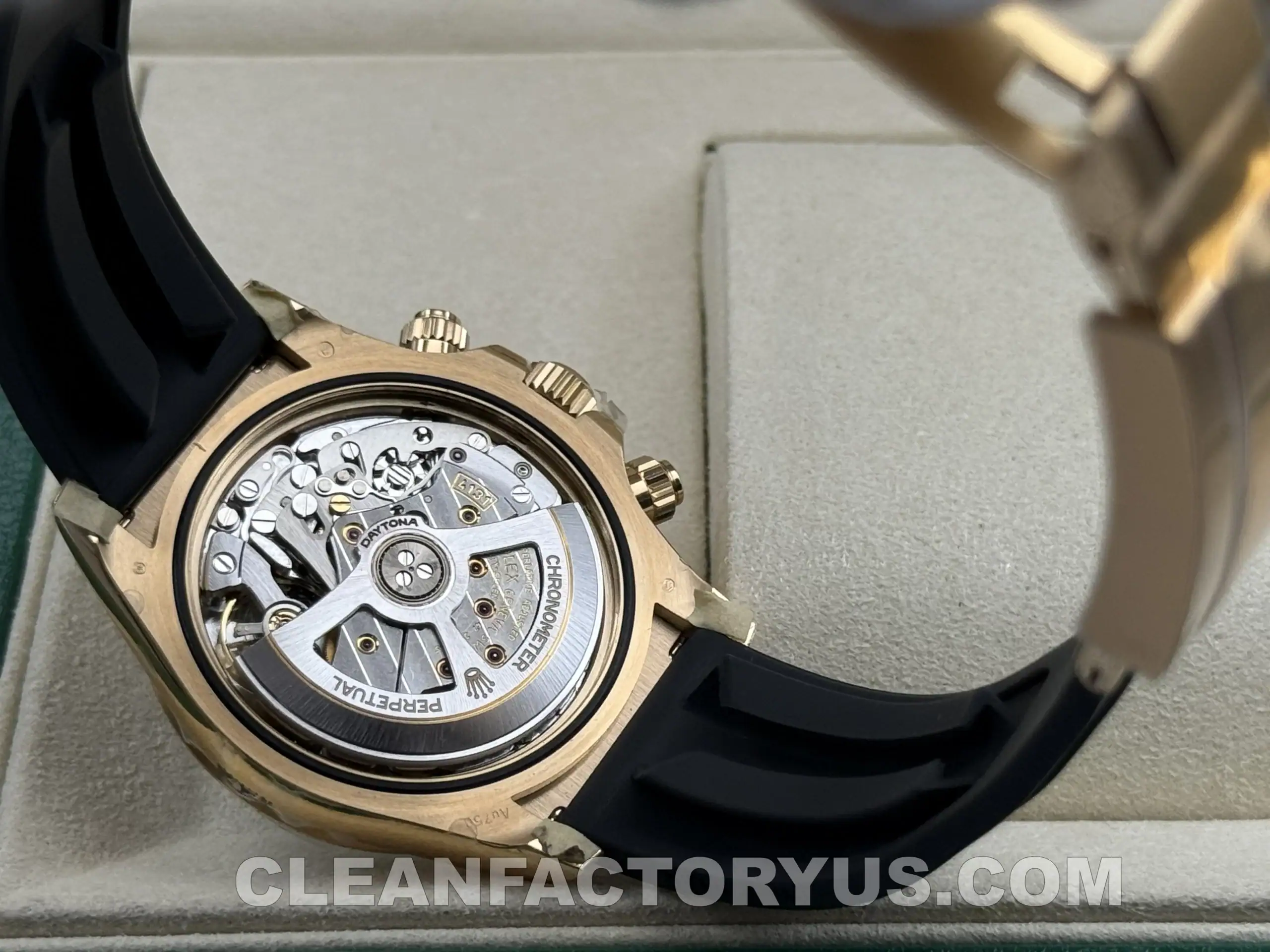
Inside the watch is a clone 4131-style automatic chronograph movement, and on a Daytona replica that matters for more than marketing reasons.
A chronograph needs to feel like one in real use. If the pushers feel vague, if the winding feels rough, or if the overall mechanical behavior feels decorative rather than functional, the watch loses credibility quickly.
This watch does fairly well in practical use. The seconds sweep is smooth, crown operation feels stable, and the chronograph pushers give enough resistance to feel deliberate rather than hollow. That helps the watch maintain a more serious mechanical character underneath a more playful visual design.
The movement also helps keep the case thickness in a range that feels much closer to what a Daytona should be. That is important because on a watch with this much visual personality, the case cannot afford to become clumsy.
As always, realism matters. This is still a clone movement, not a genuine 4131 in full architecture or long-term expectation. That difference remains. But in day-to-day use, the watch behaves in a way that feels coherent enough to support the overall design rather than undermine it.
Oysterflex-Style Strap and Daily Wear Comfort
The strap changes this watch more than many people expect.
A bracelet Daytona spreads its presence across the wrist and emphasizes polished metal. On Oysterflex, the mood shifts. The watch feels sportier, more contemporary, and often easier to wear daily despite the gold tone and bright dial.
That is a big reason why this configuration works. The black strap gives the watch tension. It stops the turquoise dial and yellow gold finish from becoming too soft or too decorative. It also makes the watch feel more casual and more modern, which is exactly the direction this reference seems to want.
The strap on this version does its job well enough. It supports the case properly, helps the watch sit securely, and keeps the wearing experience comfortable over longer periods. More importantly, it makes the whole design make sense. Without it, this reference might feel much louder.
With it, the watch feels sporty luxury rather than pure display.
Clean Factory 126518LN vs Genuine 126518LN
| Aspect | Clean Factory | Genuine |
|---|---|---|
| Case size | 40mm | 40mm |
| Overall profile | Close to expected Daytona proportions | Original reference standard |
| Dial tone | Visually strong and well controlled | Richer natural depth |
| Bezel presence | Well balanced and supportive | Slightly finer execution |
| Gold appearance | Convincing at a glance | True yellow gold warmth |
| Strap impression | Sporty and modern | More refined material confidence |
| Movement feel | Strong in daily use | Original Rolex Cal. 4131 |
| Overall identity | Very close in normal wear | Higher material and finishing truth |
Who This Watch Works For
This version makes the most sense for buyers who want a more expressive Daytona without losing the clean structure that makes the model wearable.
It is especially appealing to people who like colorful dials but still want the overall watch to feel disciplined rather than flashy. Buyers who prefer quieter or more traditional Daytona references may still lean toward the white Panda or black-dial options. But for someone who wants a more modern, sport-luxury take on the Daytona formula, this configuration offers something different.
And importantly, it offers that difference without completely abandoning balance.
Pros and Trade-Offs
Pros
- Strong overall design coherence
- Turquoise dial tone is handled better than expected
- Black bezel keeps the watch visually disciplined
- Compact Daytona profile remains intact
- Oysterflex-style strap improves daily wear comfort
- Chronograph feel is stable enough to support the watch
Trade-Offs
- Gold appearance still cannot fully match the depth of genuine yellow gold
- Final stage of finishing refinement remains different under close inspection
- Movement architecture is convincing in use, but not identical to the genuine 4131
- This is still a more niche Daytona configuration, so color preference matters more than usual
Final Thoughts
The turquoise dial is what gives this watch its identity, but it only works because the rest of the design stays under control. The black bezel keeps the color from becoming too loose, the Oysterflex-style strap shifts the watch toward a sportier and more modern feel, and the case still carries the compact profile that makes a Daytona look right on the wrist.
The gold tone adds warmth without changing the basic structure of the watch, and the chronograph side of the experience remains solid enough that the watch still feels mechanically serious rather than purely decorative. Compared with the genuine piece, the remaining difference is still there in material depth, the last stage of finishing, and the finer details that only start to matter under closer inspection.
What stands out more in daily wear is the overall balance of the watch itself. The dial, bezel, case, and strap all feel like they belong to the same design, which is probably the most important thing for a configuration like this.
FAQ
1. Does the turquoise dial look different under indoor light and sunlight?
Yes. Under indoor lighting, the dial usually appears slightly deeper and more controlled, while under natural sunlight it tends to look brighter and more vibrant. That shift is part of what gives this colorway its appeal, because the watch does not look flat or one-dimensional throughout the day.
2. Is this Daytona more eye-catching than a Panda or black-dial version?
Yes, noticeably. A white Panda or black-dial Daytona is easier to wear in a quieter way, while the turquoise dial naturally draws more attention. Even though the black bezel and Oysterflex-style strap help keep the watch balanced, this is still a more expressive configuration overall.
3. Is this a good everyday Daytona, or more of a special-piece configuration?
It depends on personal style. Structurally, it is wearable enough for daily use, especially because the strap keeps it comfortable and less formal than a full gold-style Daytona. Visually, though, the turquoise dial gives it a stronger personality, so it usually feels more distinctive than a standard everyday black or white-dial version.
4. Will the turquoise dial go out of style faster than more traditional Daytona colors?
Possibly for some buyers, but that is also part of its appeal. Traditional Daytona colors are safer and more timeless, while this one is more trend-sensitive and more individual. Buyers who want a quieter, long-term classic may still prefer the Panda or black dial, while those who want something more memorable may find this configuration more rewarding.
5. Is this version more about design impact or chronograph heritage?
More about design impact. The Daytona heritage is still there, and the chronograph layout remains part of the watch’s identity, but this particular configuration leans more into visual character than historical purity. That is why dial tone, bezel restraint, and strap balance matter so much here.


